Thursday, February 24, 2011

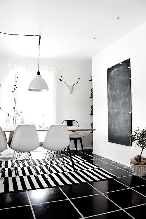
Design Cliche: B&W rugs are the confusing cleavage of decor.

We're in another cycle of black and white and grey this Spring which I'm rather excited about.  
DAY Collection via Solid Frog
It's always classy and comes back every few years just like a new Britney Spears album.  


The bad thing is that with its return comes the dreaded black and white striped rug.
via Solid Frog
Christ y'all.  There is no one in this hemisphere cheaper than this Madame but I draw the line at putting optical illusions on my floor just because it's at Ikea.   And I've put some seriously questionable shit in my house because it was on sale.  I'm looking at you Urban Outfitters pillows...
via decor8
It's almost like there's nothing else in the room because even though I try to look around all my eyes can see is that seizure-inducing pattern on the floor.  I think there might even be some kind of horrible cancer-causing chalkboard on that dining room wall but who the hell knows because OMIGAWD MY EYES!!!!  Lesson: just because it matches doesn't mean it works.


 Emily Henderson
It doesn't even make any design sense to completely detract from every other piece of boring shit in your room.   Oh, maybe that is the point...  The striped rug is like inappropriate (and eye stabbing) cleavage.  Just like if your conversation is boring and you have a hard time talking in complete sentences because golly, reading and forming your own conclusions is hard then you put on a push-up bra and a deep V and shut up.   When your other furniture sucks and you can't figure out how to decorate anything just put the most graphically bold rug you can find on the floor to distract your guests.   But it's a trap...  Obviously you want me to look at it but manners say I should respect the entire package.  Hey, my eyes and attempt at artfully arranged bookshelves are up HERE assholes!


via Material Girls
Sure you might have spent a jazillion dollars on the rest of the furniture but nobody can tell because your floor tits are hanging out.  Show some respect and put those things away.  Tsk, tsk, tsk...


via Head Over Heels
Sure it makes for a purty 2D image but if I was in the space all I would be thinking is "Don't look at the floor, don't look at the floor, don't look at the floor, look at the art, look at the art, don't look at the floor"  but eventually I'd find my eyes transfixed by the in-your-faceness of the rug.  The more you try to look away and ignore it the harder it will become.  Moley-y, mole-y, mole-y...   I don't know how you dudes do it. 


via Plush Palate
This might be the equivalent of having killer cleavage AND being an articulate conversationalist but those girls don't exist so I'm going to ignore this room for the purposes of this post.


via Head Over Heels.  I swear I read other blogs other than hers...
Zig zag induced epileptic seizure in 3... 2... 1...


If you're going to go for the most contrasting thing you can possibly think of it's best to stick with something small and tasteful like these:


Jonathan Adler via Whorange

11 comments:

  1. Clearly, the.solution is to use them as wall decor!

    ReplyDelete
  2. You are both wrong, the best place is clearly over the bed on the ceiling!

    ReplyDelete
  3. Bob - Just say 'to hell with it' and paint every wall and ceiling in black and white stripes. It'd be like wearing a bikini top to a board meeting. Go for broke, slut!

    ReplyDelete
  4. Bob, I thought mirrors were the choice for the over the bed ceiling...oops, that is for the brothel look...hehehe

    I am with you, Madame, these rugs are WRONG!

    Brenda Lynn

    ReplyDelete
  5. Brenda - how you decorate your own ceiling is up to you and the hot poolboy.

    ReplyDelete
  6. All of you are missing the point - this is about cleavage. Once you realize the whole point is to LOOK HERE, the solution becomes obvious - take the rug and make a bra out of it. Then wear a sheer white blouse that is also lower-cut than the bra. That way the bra is very obviously front and center, where the eyes should be! You're welcome.

    ReplyDelete
  7. AFF - I think you can just get rid of the shirt all together and trot around in just your B&W bra. Just like the braless wonder on Seinfeld. But more stripey.

    ReplyDelete
  8. So, MS readers, what is the interior design equivalent to butt cleavage?

    ReplyDelete
  9. Zrzuce - Usually I try to avoid looking at butt cleavage at all costs so I'll say the decor equivalent to that would be a dead body in the corner. Aw hell, I'd probably want to look at that too. I'll go with anything mauve then.

    ReplyDelete
  10. Absolutely excellent stuff ... I more or less found what I was looking for within 3 days of signing for the premium membership and am looking forward to getting lots more excellent deals.

    ReplyDelete